
Card
Works in
Page Type
- Homepage
- Default Page
- Landing Page
Block Role
Child block Card Grid
Screenshot
Section titled “Screenshot”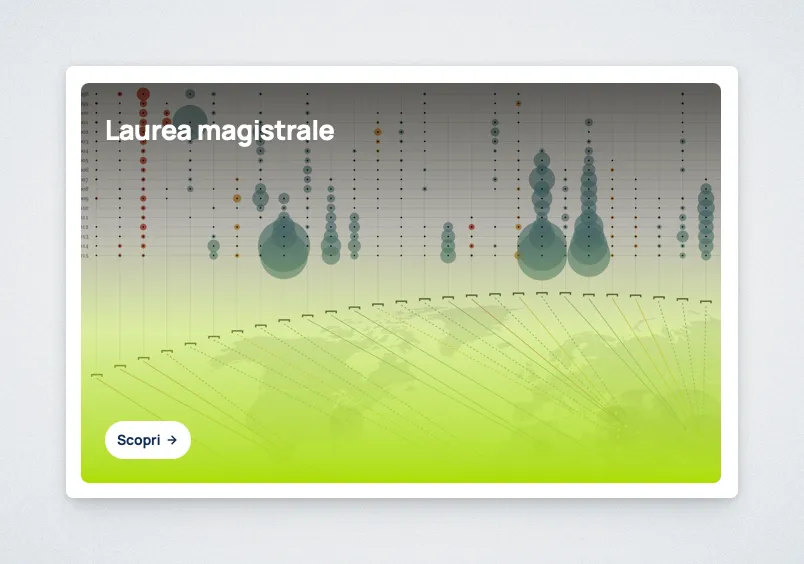
Purpose
Section titled “Purpose”The Card block creates an image-based navigation card inside a Card Grid.
Use it to guide visitors toward another page, archive, section, or external resource. The card also visually highlights the destination with an image, eyebrow, heading, and call to action.
This block should always have a clear link target. If the content does not need to send users somewhere, use another content block instead.
Controls
Section titled “Controls”EyebrowHeadingCTA TextCTA URLCard Background Image
Behavior Notes
Section titled “Behavior Notes”- This block can only be inserted inside a Card Grid.
- The card is primarily a navigation element, not a generic content container.
- If no CTA text is set, the block uses
Scopriby default. - The selected image is displayed as the card background.
- If the background image is missing, the card uses the orange missing-asset background. This treatment applies only to this image-backed Card type, not to Card (Text).